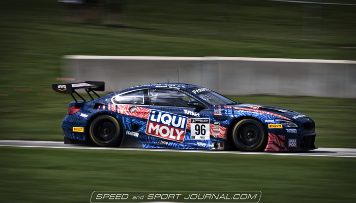
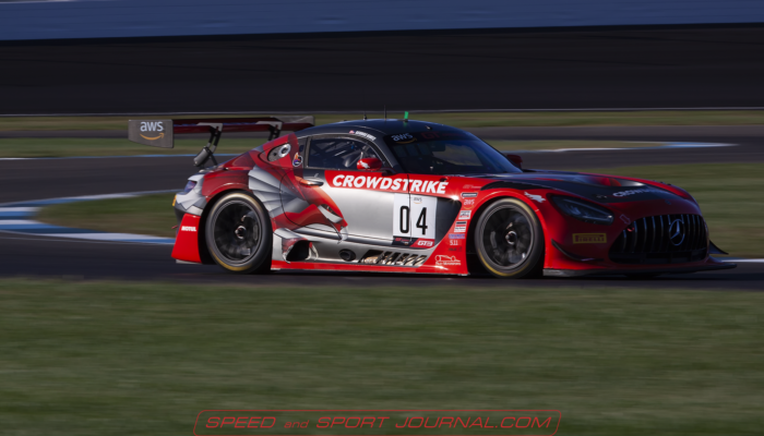
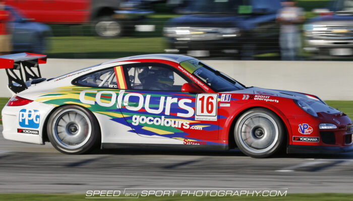
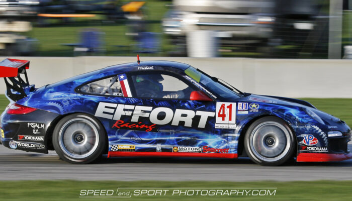
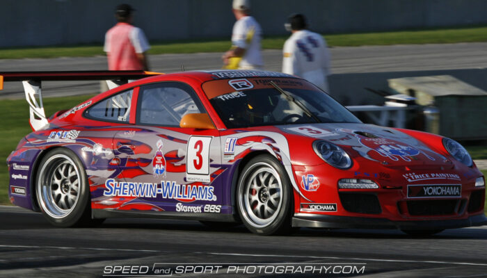
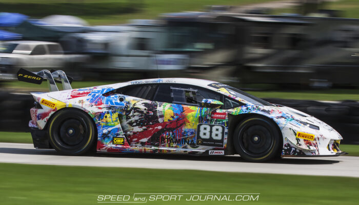
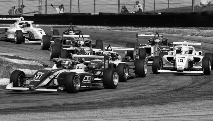
If you had a race car, put a number on it and painted it white, it would still be a race car, Maybe a very fast race car. It just would not be very interesting to look at. Now imagine every other car in the race were painted exactly the same, things would be kinda of dull. In the past most cars were painted one color. This was usually the color that represented its manufacturer (with maybe a stripe or two). Through the following years, cars began to become more colorful. Later still graphics and liveries began to be more multi color, and more complex graphic designs began to appear.
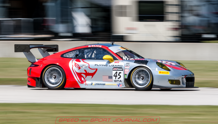
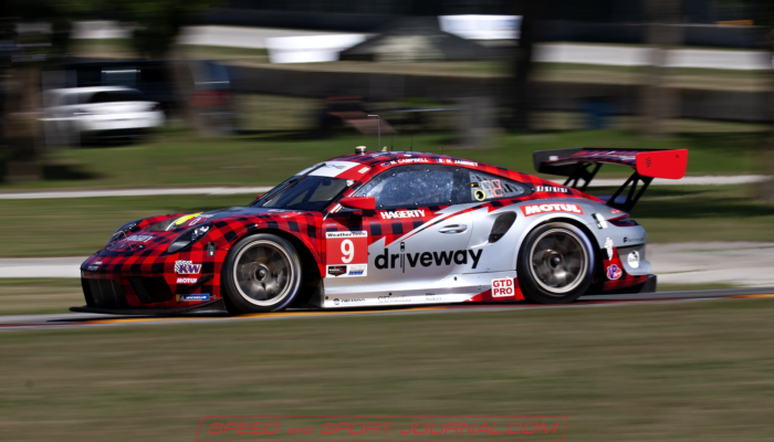
Today with the advent of vinyl wraps, you can adorn race cars with just about anything you can imagine. This could be anything from a sponsor, to the team itself, or even a cause or charity. However sometimes you are locked into whatever your sponsors logo dictates. If you are lucky you can find a way to incorporate it into something artistic and tasteful. If not you could end up with a very ugly haphazard looking design. Some teams have what have become iconic liveries, and sponsors have to tailor their logo to fit them.
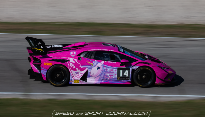
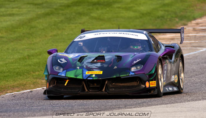
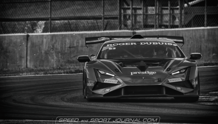
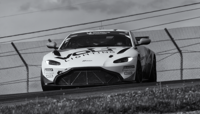
Here are some examples of what I feel are well done liveries. Some are lucky enough to not have to worry about a sponsors design, and are able to do their own thing. I often tell people the photographers dirty little secret is that it is not always the fastest car on track that gets the most pictures, it’s the best looking.
Joel
